Stunningly different: a project with a mission in Amsterdam



Stunningly different: a project with a mission in Amsterdam
Century-old, typically narrow brick houses, their gabled Renaissance façades reflected by the Old Town’s ‘grachten’, the ubiquitous canal system – this is the slightly clichéed picture conjured up by Amsterdam, and it could not be further away from bold, contemporary architecture. The Netherlands, though, have been a hotbed for modern art and radical design innovation since the 1920s: we owe to creative Dutch minds, from Piet Mondriaan to Gerrit Rietveld to Rem Koolhaas, some of the most disruptive evolutions in the way we interact with colours, shapes and living spaces. Accordingly, ‘studio thonik’– a new building in Amsterdam that has become instantly iconic – is not nearly as unexpected as it might seem at first sight.
It is nonetheless highly unusual in more than one respect. A foray into architecture by a gifted graphic designer who is at the same time the building’s owner, it defied conventions right from the start. A multi-purpose construction with long term, built-in flexibility, it is sustainable not simply by its execution, but by its very concept. And with its dazzling striped façades, it has transformed a small, rather unpromising lot on nondescript Wibaustraat, the main arterial road south of the city centre, into an overnight landmark.
Breaking the rules
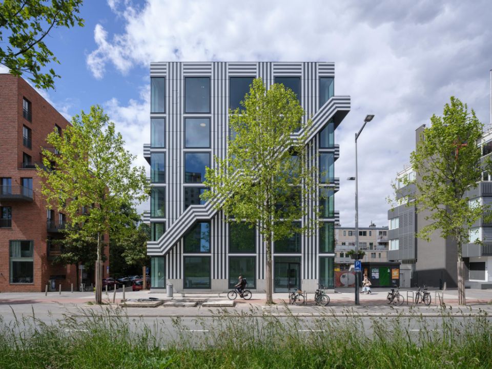
The one-of-kind skin of the building and the bold external staircase that bisects the main façade make a strikingly original use of Trespa® Meteon® panels in two solid colours – Athens White and New York Grey. Thomas Widdershoven, who founded the design agency thonik together with Nikki Gonnissen, explains: “thonik was founded back in 1993, and in the meantime, we have transitioned from analog to digital. But beyond images, we are fascinated by spatial graphic design. What would have been better suited to explore this new area than designing our own building? And that is what we did. To proceed with the project, though, we needed a very capable and open-minded sparring partner, which we found in Arjan van Ruyven of MMX-architecten”.
With a portfolio that includes the Botel, a ‘hotelboat’ crowned by an oversize logo made of habitable letters (designed in collaboration with Jord den Hollander), MMX have made it abundantly clear: they are experts at combining outside-the-box thinking and technical know-how.
Arjan van Ruyven sums it up: “Thomas had all the ideas, and he was keen to keep full control. This suited me well: I like outspoken people with strong opinions. At the same time, he needed somebody to further develop the structure that is at the same time a building, a sculpture and a totally accurate transcription of his original concept: this was my own contribution as an architect”.
Thomas Widdershoven continues: “From the start, I had been aiming for the visual impact of ‘open and closed’ façades. I wanted to alternate floor-to-ceiling windows with a simple and stringent pattern of stripes to achieve a well-balanced visual impact. As a graphic designer, I’m fond of stripes. This is something I understand, and I guess I know how to put them to good use. But this was only one aspect of the project. I wanted our new building to be a statement, to fulfill a mission that would go well beyond its primary function and the way it looks”.
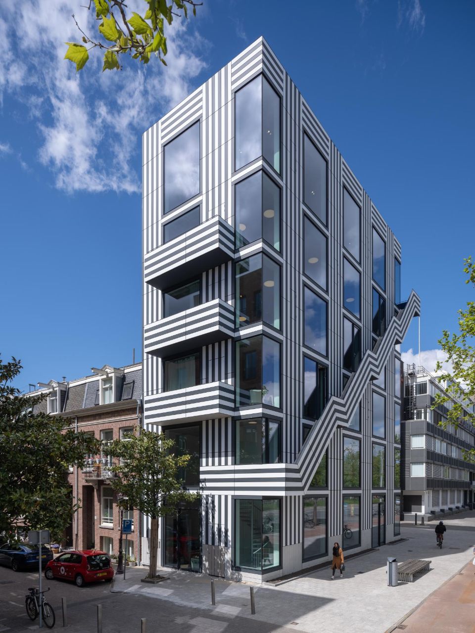
He brings it to the point: “First of all, the inner space had to be extremely versatile – the four top floors, for example, are offices today, but can become apartments tomorrow, and the two lower floors can be used as a restaurant, as is the case right now, or turned into retail space. Then, the building had to meet the ZNC (Zero Net Carbon) efficiency standards. And finally, the whole concept had to be not only innovative, but societally relevant and long-lasting. These latter aspects are the true key to real, enduring sustainability”.
“This helped, by the way, to comply with the zoning rules, which are demanding”, Thomas Widdershoven adds. “It literally took me years to get my (admittedly complicated) ideas approved. I own the building, but I had to lease the land, which is owned by the city. This is quite typical for what I call our ‘Democratic Dutch Model’: as the city is and remains directly involved in a project like ours, it helps to have a really watertight concept, especially for a building that deeply challenges aesthetic conventions. Amsterdam, by the way, could use a few more offices that truly reflect the creative companies that use them, rather than all that run-of-the-mill ‘contemporary’ architecture owned by corporations”.
.jpg)
Meteon® panels ticked all the boxes
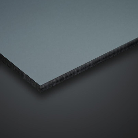
The skin of the building being meant as a graphic manifesto for a company that is itself a graphic design studio, Thomas Widdershoven would leave nothing to chance: “We had used Trespa® HPL panels for signage purposes as part of some client projects. I therefore knew about the outstanding resistance and durability of the material. Trespa® products, though, still elicit those associations with social housing from the 70s and 80s in the Netherlands. This made me hesitant at first. Nonetheless, we ordered some samples of Trespa® Meteon® Lumen. I was immediately struck by how good the panels actually looked: I particularly liked the Lumen Diffuse finish, which is very beautiful and expressive. It definitely has an upscale look and feel”.
The next feature that turned out being very much to his liking was the colour palette: “Remon Bakker, the Trespa representative, was very helpful – and he is passionate about the product. When he presented the Meteon® samples, his enthusiasm proved contagious! I zeroed in on the off-white of ‘Athens’ and the dark grey of ‘New York’. They were so much better than just plain black and white, which I doubt would have worked nearly as well. These two shades interact with each other in a much more refined way”. Arjan van Ruyven, the architect in charge of studio thonik at MMX-architecten, adds: “When I saw the Meteon® samples, it struck me instantly – this is it! We had quite a few other samples at the office, but Meteon® Lumen had a tactility and a tonal depth that were unique. The fact that the edges of the HPL (High Pressure Laminate) are naturally dark is another advantage worth mentioning: this came in very handy. It helped us achieve the clean definition of each panel – which we needed to preserve the crisp, linear clarity of the design”.
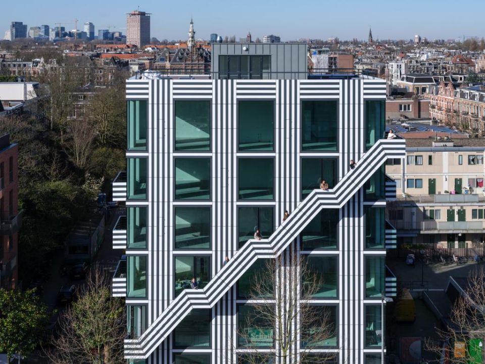
He points out that the Diffuse finish was, as well “exactly what we needed”: the panels, while not entirely matt, reflect only a tiny fraction of the incoming light in a very subtle way, thus enhancing the colours while avoiding any interference with the building’s graphic signature – the arrestingly striped skin that unifies the façades, the balconies and the diagonal stairs.
A creative concept in need of creative solutions
Arjan van Ruyven describes the approval process for this one-of-a-kind project with a smile: “It was a somewhat winding and slippery road”. The next step was to find an installer who would be up to the task. Arjan van Ruyven comments: “We needed a company with the know-how to do things well and efficiently, in order to contain the costs – with no compromise whatsoever in terms of execution. As ventilated façades go, the project was a total one-off. This called for an installer able to contribute his own creative approach”.
Each individual off-white or dark grey Meteon® Lumen panel is fairly small. Accordingly, fastening it directly to the sub-frame was not the way to go: the individual strips are simply too narrow. Modules consisting of 5-6 strips were therefore pre-assembled on larger panels – the longest one is a full 3m. Arjan van Ruyven points out: “This had the additional benefit of preventing the unavoidable building tolerances to interfere with the regularity of the pattern: it helped us keep the graphic language nice and clean”.
There was still one more problem to solve: the design is based on continuous lines, which extend across the panels. “Out of practical considerations, we had to come up with a consistent system of joint gaps – wide enough for technical purposes without becoming visually annoying. It was all about the right level of disruption. But here again, a solution was found by Michon, the installer whom we ended up putting in charge of the project”. Thomas Widdershoven adds: “We were in touch with two installers; the second one, Michon, just came across as smarter and better attuned to the challenges of the project: they had a decidedly creative approach. This convinced me that we were in good hands“.
A deep knowledge of the material makes all the difference
Ron van der Laak is the general manager of Michon B.V., a roofing and façade specialist from Vianen, a suburb of Utrecht. While acknowledging that studio thonik was indeed a demanding project, he underscores the expertise of his company as a key factor: “We came up with a bespoke sub-framing design that we developed specifically for studio thonik. This was decisive: it allowed us to install the Trespa® Meteon® panels in a way never used before in the Netherlands. We have been using Trespa® products for three decades: we have completed many projects involving panels from Trespa over the years; this have given us a deep understanding of the material, its possibilities and its technical constraints”.
Michon cut all Meteon® panels to size in their own workshop, as the company is both experienced and well equipped: “The Meteon® Lumen panels are available in a choice of three standard sizes – 3650 x 1860 mm, 2550 x 1860 mm and 3050 x 1530 mm. We took advantage of this to rationalise the process, and then, we devised a system of our own to further reduce the cutting losses. With a complex project like this one, it is all about efficiency and know-how. Before you make an offer, you better figure out first how to deal with the challenges down the road: this was true for the cutting process – which was the easy peasy part – and for the project-specific sub-framing, which we literally had to invent”.
While Michon is also installing regularly fibre cement cladding (“It comes with advantages of its own”, as Ron van der Laak points out), the company appreciates both the reliability and the resistance of the Trespa® Meteon® panels. The large colour range is another advantage. In addition, Ron van der Laak points out: “They even offer a double-sided decorative option for applications where both panel sides remain visible”. He concludes: “To me, it’s obvious: as far as High Pressure Laminate is concerned, there is no real alternative to the Trespa® façade panels – it’s the best product on the market, plain and simple”.
The recipe for success
Bouwbedrijf Van Schaik, a building firm from Breukelen, south of Amsterdam, was the general contractor for the studio thonik project. Jarco van Dam, the company’s deputy manager, underscores the specific challenges of the project: “Our company is equally involved in new developments and renovations. Here, we had to build from scratch on what I would call a ‘stamp-sized’ lot, which comes with constraints of its own, especially in terms of logistics. But we know how to deal with such a situation, and we are good at it”.
For Jarco van Dam, two criteria tipped the scale in favour of Van Schaik – the competitive offer his company submitted, and more importantly, the confidence that came with Van Schaik’s well-established expertise : “We work mostly with our own team – which is not the rule with general contractors, as you might know. So when the project is demanding, and studio thonik definitely was, we certainly have an edge, because we have extensive control over what happens on the site. This was all the more important here since we had to proceed with utmost dimensional precision, in order for Michon to properly install the ventilated façade. The building has a prefabricated concrete structure that had to be positioned very accurately, as the façade’s design – with its two-tone strips premounted on large panels and its continuous linear patterns – is absolutely unforgiving”.
For Bouwbedrijf Van Schaik, studio thonik was not the first project that featured Trespa® products, but the company had never been confronted with a design so uncompromising and unusual. Jarco van Dam comments: “We had done projects featuring ventilated façades with Trespa® Meteon® panels. The material is widely used: it is highly weather-resistant, durable and reliable. When you choose Trespa® products, you needn’t worry: the whole system is tried-and-tested and the façade will look good, no doubt about it. Although the complexity of studio thonik was on a level of its own and the sub-framing was definitely non-standard, the end result was no exception”. He concludes: “We kept communicating with each other – between the architect, the owner, the installer and us – and everybody was very professional. As a result, the design of the architect and the vision of the owner have come 100% true. This is what really mattered and what has made studio thonik such a great project!”.
 EN/US
EN/US


