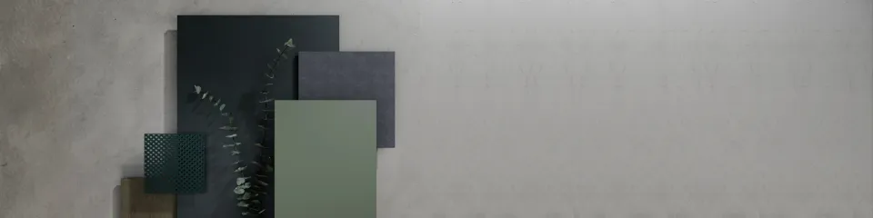
Mix and Match – Urban Edition
Modern cities demand façades that balance durability, identity, and design precision. The Trespa Urban palette offers a sophisticated material expression, combining deep architectural greys and mineral-inspired textures with a green signature accent that introduces subtle freshness without disrupting compositional strength.
Rooted in Trespa® Meteon® surface technology, this palette enables architects to articulate buildings that feel grounded, modern, and connected to their environment, while delivering long-term performance and minimal maintenance.
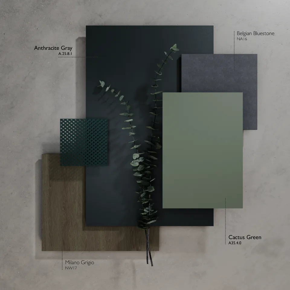
This mood board showcases four carefully chosen Trespa® Meteon® finishes that collectively establish a refined and contemporary language for urban façade design:
Anthracite Grey (A.25.8.1): Imparts pronounced architectural depth and strength.
Perfect for highlighting frames, corners, and window surrounds, this robust grey delivers crisp lines and geometric precision, affirming the structure’s presence within the urban landscape.
Cactus Green (A35.4.0): A sophisticated, modern accent green.
Used sparingly, Cactus Green introduces a sense of renewal and vibrancy to the façade, often applied to vertical elements such as circulation zones, balconies, or bespoke highlights. Its refined tone adds a touch of biophilic connection, evoking the optimism of urban nature, while maintaining a cohesive, understated look.
This accent not only enlivens the composition but also signals movement and identity, guiding the eye through the building’s architecture.
.webp)
Belgian Bluestone (NA16): Brings a sense of mineral authenticity and depth, reminiscent of finely crafted stone.
Ideal for grounding the lower façade, this finish provides tactile realism and robustness, offering both visual weight and elegance to urban exteriors.
.jpg)
Milano Grigio (NW17): Presents a gentle, concrete-like texture suited for expansive elevations.
This soft, neutral hue acts as a calming backdrop, harmonising darker tones and accent shades, and enhancing the sense of openness and rhythm in the overall design. Its subtle presence supports both clarity and a feeling of contemporary serenity.
.jpg)
Every decor has been selected not only for its distinct character but also for its harmonious compatibility with the others, enabling architects to craft multi-layered compositions, clearly defined volumes, and a timeless architectural presence that feels both grounded and forward-looking.
As each tone is distinctive, yet intentionally compatible, designed to support layered compositions, clear volume articulation, and timeless architectural expression.
The Anthracite Grey (Trespa® Meteon® Uni Colours – A25.8.1) creates a sculptural presence by defining edges and volumes. At the Jiangyin Environmental Bureau, the façade is anchored, while green accents highlight circulation zones, contributing to a dynamic urban aesthetic.
The Belgian Bluestone (Trespa® Meteon® Naturals – NA16) adds mineral depth and realism. At ‘House Sinsin’ in Belgium, it grounds the building's lower planes with texture and authenticity.
The Milano Grigio (Trespa® Meteon® Wood Decors – NW17) acts as a neutral canvas, softening the overall composition. At Villa Clarice in Italy, it balances darker tones with a calm backdrop.
The Cactus Green (Trespa® Meteon® Uni Colours – A35.4.0) introduces a vibrant green accent, adding life and identity to the design without being overwhelming.
For instance, at Casa Nespolo in Italy, the strategic placement of this colour accentuates focal points and creates a rhythmic flow through the building's form, enhancing its visual dynamism and connecting it to the surrounding environment.
These four Trespa® decors contribute to a modern, tactile, and bold façade, celebrating material authenticity and urban sophistication.
Leveraging the Trespa urban palette to define architectural character
This combination works on multiple levels:
Materially, Trespa® Meteon® panels offer long-term colour stability, durability, and precise finishes.
Compositionally, layered tones and accents guide the eye, articulate volumes, and enrich architectural storytelling.
Contextually, the palette resonates with urban environments, referencing heritage while expressing contemporary sophistication.
Colour Combinations:
- Anthracite Grey and Cactus Green: Bold, contemporary statement.
- Milano Grigio and Belgian Bluestone: Soft, textured sophistication.
- All four colours: Cohesive structure, neutrality, depth, and dynamic accent.
.webp)
Tips for Application
Anchor with dark shades: Employ deeper, darker tones at the base or core of your design to provide a sense of stability and grounding. These hues help define the structure’s foundation, while lighter, more neutral tones can be introduced in upper or expansive areas to create a sense of openness and visual lift.
Strategic use of green highlights: Incorporate green accents thoughtfully and sparingly. A touch of green placed in key locations—such as vertical bands, balcony edges, or pathways—can bring a lively, biophilic element to the façade without overwhelming the overall scheme.
Layer textures and finishes: Combine the smooth, even appearance of Uni Colours with the tactile, nuanced quality of Naturals. This interplay between finishes adds depth and interest, creating dynamic surfaces that change with the light and viewpoint.
Respond to the building’s context: Consider the building's orientation and how sunlight interacts with each façade. By selecting and positioning colours and finishes based on light exposure, you can enhance both the visual impact and the long-term performance of the materials used.
Inspired by the Urban Mood Board by Trespa?
Embracing a mix-and-match approach with Trespa®'s diverse portfolio of decors opens up a realm of design possibilities. By thoughtfully combining different tones and textures, architects can craft façades that are not only visually striking but also resonate with the building's environment and purpose.
Mix Trespa® Meteon® colours to unlock new aesthetic dimensions in your architectural narrative. Request a physical sample combining Trespa® Meteon® collections to evaluate composition in daylight.
Note: Digital images cannot fully capture the tactile grain or subtleties of finish; physical samples are essential for accurate design decisions.
Stay tuned for more architectural mood board explorations in our "Mix and Match" series.
 EN/US
EN/US


