Terra Tones in Façade Design
Mixing Ochre Shades and Natural Finishes with Trespa® Panels
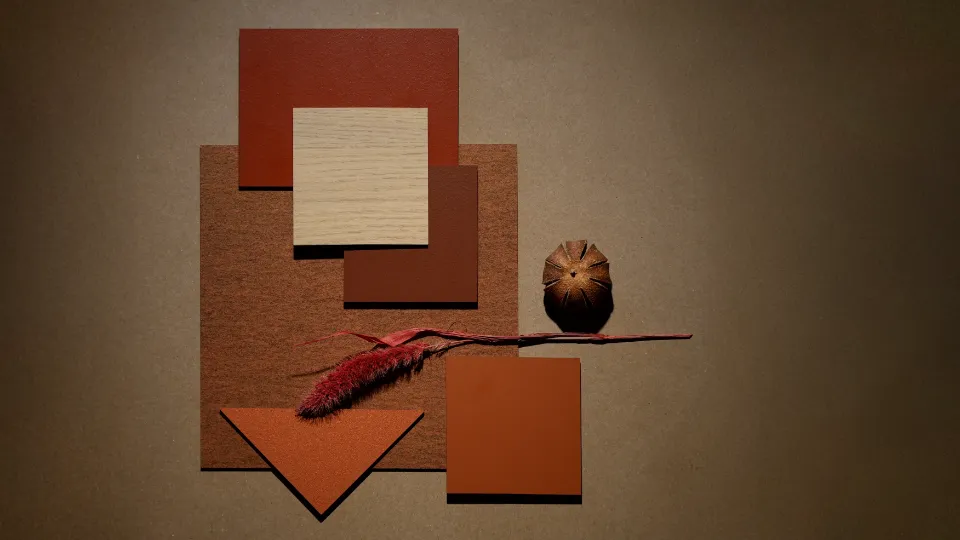
In architectural expression, façades have the power to evoke place and memory through material and tone. The Terra mood board by Trespa draws on the expressive warmth of ochres and oxidised hues, softened by natural wood finishes—an ideal spring-inspired aesthetic rooted in material authenticity and contemporary poise.
Exploring the Terra-Inspired Palette
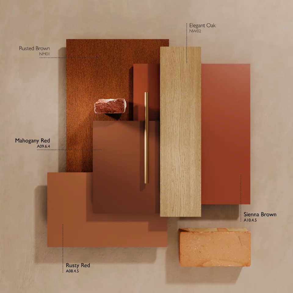
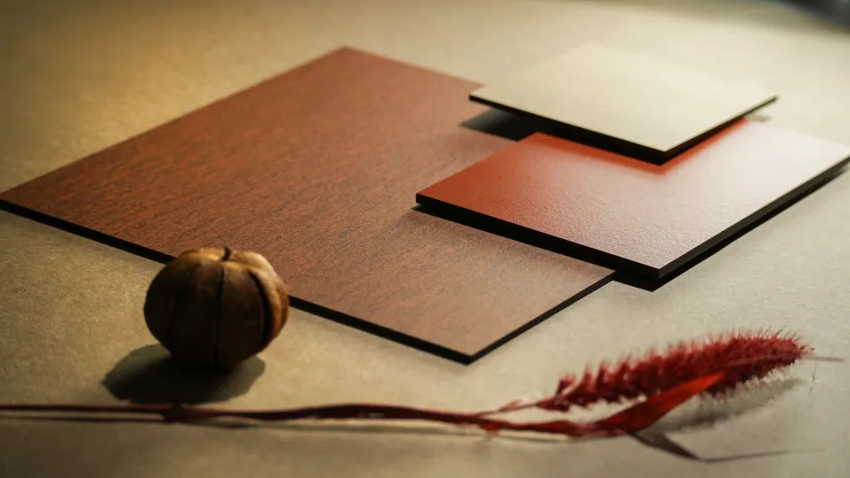
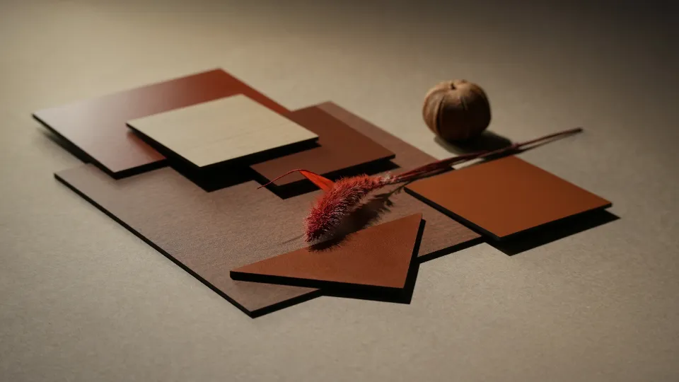
This bold, yet balanced mix of Trespa® Meteon® Uni Colours and Trespa® Meteon® Woods offers depth, texture and a refined palette:
- Rusty Red (A08.4.5) – An intense ochre-red, with industrial energy.
- Sienna Brown (A10.4.5) – A sophisticated earthy hue rich with warmth.
- Mahogany Red (A09.6.4) – A deep, elegant red with timeless character.
- Elegant Oak (NW02) – A soft, tactile natural wood decor that moderates intensity.
- Rusted Brown (NM01) – A textured, oxidised tone suggesting weathered material presence.
These tones, woven together, create compositions that evoke earth, clay, aged metals and timber: dynamic, grounded and refined.
Discover Trespa® Meteon®
Architectural Projects Showcasing the Trespa Terra Palette
While exact built examples combining all five Trespa Terra tones can be scarce, several architectural projects effectively integrate individual hues from this palette, offering strong reference points
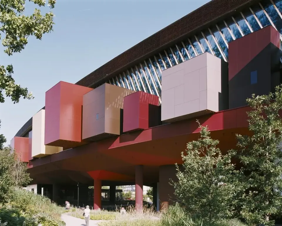
Musée du Quai Branly – Jacques Chirac, Paris
Designed by Jean Nouvel, the Musée du Quai Branly stands as an emblem of architectural storytelling, where colour, material, and context converge. The façade is a vibrant, layered composition of Trespa® Meteon® panels, harmonising earthy pigments such as Mahogany Red (A09.6.4) and Sienna Brown (A10.4.5) with deeper tones like Wine Red (A12.6.3) and Dark Brown (A08.8.1). These shades mirror the natural patina of weathered materials, reinforcing the museum’s dialogue with non-Western art and indigenous cultures.
In this project, colour is not a decorative afterthought. It is integral to the building’s narrative, creating rhythm and cultural resonance across its textured volumes. The inclusion of ochre and taupe tones further enhances the warmth of the structure, creating geological strata or sun-aged surfaces. The result is a façade that is not only visually compelling but also contextually rich, a reference point for architects exploring expressive, earthy palettes in contemporary urban environments.
Oxley Park, Milton Keynes
Oxley Park is a forward-thinking residential development in Milton Keynes where colour is used not only as visual punctuation but as a tool for place-making and identity. The façade treatment is defined by a curated mix of warm earth tones—notably Mahogany Red (A09.6.4) and Sienna Brown (A10.4.5)—alongside neutral anchors such as Anthracite Grey (A25.8.1) and White (A03.0.0). This thoughtful palette injects character into the streetscape while preserving a cohesive architectural language across the housing blocks. The application of Carmine Red (A12.3.7) and Wine Red (A12.6.3) adds depth and dynamism, giving each elevation a tactile and layered quality. Within this composition, the Trespa® Terra-inspired shades stand out, grounding the contemporary forms in a sense of warmth and material authenticity. The result is a development that blends urban density with tonal richness—an example of how nuanced colour integration can enhance residential architecture and foster a stronger connection between built environment and community.
.webp)
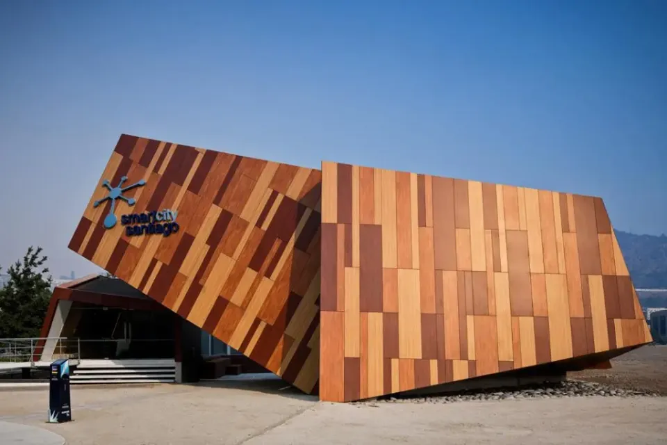
Smartcity Del Parque 4980, Santiago, Chile
The Smartcity Del Parque 4980 project in Santiago exemplifies a balanced integration of advanced design with tactile, natural finishes. The façade composition features a combination of Trespa® Meteon® Naturals decors, including Elegant Oak (NW02), a soft, contemporary wood tone that aligns seamlessly with the Trespa® Terra palette, as well as Pacific Board (NW04) and English Cherry (NW10). This trio of surfaces reflects a deliberate contrast between softness and structure, offering visual depth and material warmth within a metropolitan setting. The architecture achieves a harmonious dialogue between innovation and texture, with Elegant Oak serving as a subtle mediator that softens the stronger grains and enriches the building’s exterior with refined, organic hues. The result is a façade that feels timeless, approachable, and architecturally articulate.
Design Strategy & Implementation
- Anchor bold tones (Rusty Red (A08.4.5), Sienna Brown (A10.4.5), Mahogany Red (A09.6.4) with subtle wood accents (Elegant Oak (NW02)).
- Use rich colour areas to frame entries, create vertical fins, or feature zones.
- Integrate wood tones across large volumes or recessed surfaces to break colour intensity and humanise the scale.
- In multi-segment façades, alternate rusted and neutral tones rhythmically create dynamic façade composition.
Why This Palette Works
- Material Expression: Ochre tones recall clay and rust—anchoring buildings to their geological context.
- Textural Contrast: The natural grain of oak softens intense Uni colours and adds depth.
- Architectural Versatility: From public institutions to residential schemes, the Trespa® Terra palette adapts to both expressive and restrained typologies.
- Colour Stability & Durability: Trespa® panels offer enduring performance and consistent tone, even when mixed.
Inspired by Terra Mood Board by Trespa?
Embracing a mix-and-match approach with Trespa®'s diverse portfolio of decors opens up a realm of design possibilities. By thoughtfully combining different tones and textures, architects can craft facades that are not only visually striking but also resonate with the building's environment and purpose.
Mix Trespa® Meteon® colours Rusty Red (A08.4.5), Sienna Brown (A10.4.5), Mahogany Red (A09.6.4), Elegant Oak (NW02), and Rusted Brown (NM01) to unlock new aesthetic dimensions in your architectural narrative.
Request a physical sample combining Trespa® Meteon® collections and to evaluate composition in daylight here
Note: Digital images cannot fully capture the tactile grain or subtleties of finish; physical samples are essential for accurate design decisions.
Stay tuned for more architectural mood board explorations in our "Mix and Match" series.
 EN/GB
EN/GB


